5. Basic Plots
We look at some of the ways R can display information graphically. This is a basic introduction to some of the basic plotting commands. It is assumed that you know how to enter data or read data files which is covered in the first chapter, and it is assumed that you are familiar with the different data types.
In each of the topics that follow it is assumed that two different data sets, w1.dat and trees91.csv have been read and defined using the same variables as in the first chapter. Both of these data sets come from the study discussed on the web site given in the first chapter. We assume that they are read using “read.csv” into variables w1 and tree:
>  w1 <- read.csv(file="w1.dat",sep=",",head=TRUE)
> names(w1)
[1] "vals"
>  tree <- read.csv(file="trees91.csv",sep=",",head=TRUE)
> names(tree)
 [1] "C"      "N"      "CHBR"   "REP"    "LFBM"   "STBM"   "RTBM"   "LFNCC"
 [9] "STNCC"  "RTNCC"  "LFBCC"  "STBCC"  "RTBCC"  "LFCACC" "STCACC" "RTCACC"
[17] "LFKCC"  "STKCC"  "RTKCC"  "LFMGCC" "STMGCC" "RTMGCC" "LFPCC"  "STPCC"
[25] "RTPCC"  "LFSCC"  "STSCC"  "RTSCC"
5.1. Strip Charts
A strip chart is the most basic type of plot available. It plots the data in order along a line with each data point represented as a box. Here we provide examples using the w1 data frame mentioned at the top of this page, and the one column of the data is w1$vals.
To create a strip chart of this data use the stripchart command:
> help(stripchart)
> stripchart(w1$vals)
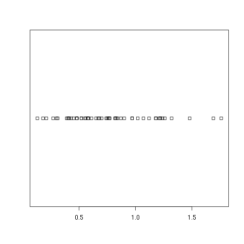
As you can see this is about as bare bones as you can get. There is no title nor axes labels. It only shows how the data looks if you were to put it all along one line and mark out a box at each point. If you would prefer to see which points are repeated you can specify that repeated points be stacked:
> stripchart(w1$vals,method="stack")
A variation on this is to have the boxes moved up and down so that there is more separation between them:
> stripchart(w1$vals,method="jitter")
If you do not want the boxes plotting in the horizontal direction you can plot them in the vertical direction:
> stripchart(w1$vals,vertical=TRUE)
> stripchart(w1$vals,vertical=TRUE,method="jitter")
Since you should always annotate your plots there are many different ways to add titles and labels. One way is within the stripchart command itself:
> stripchart(w1$vals,method="stack",
             main='Leaf BioMass in High CO2 Environment',
             xlab='BioMass of Leaves')
If you have a plot already and want to add a title, you can use the title command:
> title('Leaf BioMass in High CO2 Environment',xlab='BioMass of Leaves')
Note that this simply adds the title and labels and will write over the top of any titles or labels you already have.
5.2. Histograms
A histogram is very common plot. It plots the frequencies that data appears within certain ranges. Here we provide examples using the w1 data frame mentioned at the top of this page, and the one column of data is w1$vals.
To plot a histogram of the data use the “hist” command:
> hist(w1$vals)
> hist(w1$vals,main="Distribution of w1",xlab="w1")
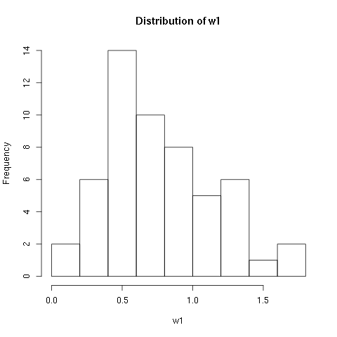
As you can see R will automatically calculate the intervals to use. There are many options to determine how to break up the intervals. Here we look at just one way, varying the domain size and number of breaks. If you would like to know more about the other options check out the help page:
> help(hist)
You can specify the number of breaks to use using the breaks option. Here we look at the histogram for various numbers of breaks:
> hist(w1$vals,breaks=2)
> hist(w1$vals,breaks=4)
> hist(w1$vals,breaks=6)
> hist(w1$vals,breaks=8)
> hist(w1$vals,breaks=12)
>
You can also vary the size of the domain using the xlim option. This option takes a vector with two entries in it, the left value and the right value:
> hist(w1$vals,breaks=12,xlim=c(0,10))
> hist(w1$vals,breaks=12,xlim=c(-1,2))
> hist(w1$vals,breaks=12,xlim=c(0,2))
> hist(w1$vals,breaks=12,xlim=c(1,1.3))
> hist(w1$vals,breaks=12,xlim=c(0.9,1.3))
>
The options for adding titles and labels are exactly the same as for strip charts. You should always annotate your plots and there are many different ways to add titles and labels. One way is within the hist command itself:
> hist(w1$vals,
       main='Leaf BioMass in High CO2 Environment',
       xlab='BioMass of Leaves')
If you have a plot already and want to change or add a title, you can use the title command:
> title('Leaf BioMass in High CO2 Environment',xlab='BioMass of Leaves')
Note that this simply adds the title and labels and will write over the top of any titles or labels you already have.
It is not uncommon to add other kinds of plots to a histogram. For example, one of the options to the stripchart command is to add it to a plot that has already been drawn. For example, you might want to have a histogram with the strip chart drawn across the top. The addition of the strip chart might give you a better idea of the density of the data:
> hist(w1$vals,main='Leaf BioMass in High CO2 Environment',xlab='BioMass of Leaves',ylim=c(0,16))
> stripchart(w1$vals,add=TRUE,at=15.5)
5.3. Boxplots
A boxplot provides a graphical view of the median, quartiles, maximum, and minimum of a data set. Here we provide examples using two different data sets. The first is the w1 data frame mentioned at the top of this page, and the one column of data is w1$vals. The second is the tree data frame from the trees91.csv data file which is also mentioned at the top of the page.
We first use the w1 data set and look at the boxplot of this data set:
> boxplot(w1$vals)
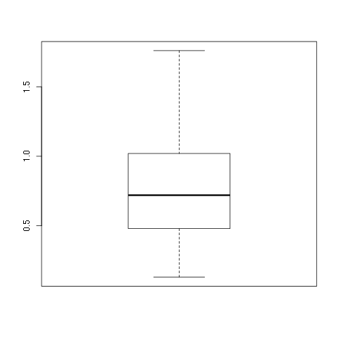
Again, this is a very plain graph, and the title and labels can be specified in exactly the same way as in the stripchart and hist commands:
> boxplot(w1$vals,
          main='Leaf BioMass in High CO2 Environment',
          ylab='BioMass of Leaves')
Note that the default orientation is to plot the boxplot vertically. Because of this we used the ylab option to specify the axis label. There are a large number of options for this command. To see more of the options see the help page:
> help(boxplot)
As an example you can specify that the boxplot be plotted horizontally by specifying the horizontal option:
> boxplot(w1$vals,
          main='Leaf BioMass in High CO2 Environment',
          xlab='BioMass of Leaves',
          horizontal=TRUE)
The option to plot the box plot horizontally can be put to good use to display a box plot on the same image as a histogram. You need to specify the add option, specify where to put the box plot using the at option, and turn off the addition of axes using the axes option:
> hist(w1$vals,main='Leaf BioMass in High CO2 Environment',xlab='BioMass of Leaves',ylim=c(0,16))
> boxplot(w1$vals,horizontal=TRUE,at=15.5,add=TRUE,axes=FALSE)
If you are feeling really crazy you can take a histogram and add a box plot and a strip chart:
> hist(w1$vals,main='Leaf BioMass in High CO2 Environment',xlab='BioMass of Leaves',ylim=c(0,16))
> boxplot(w1$vals,horizontal=TRUE,at=16,add=TRUE,axes=FALSE)
> stripchart(w1$vals,add=TRUE,at=15)
Some people shell out good money to have this much fun.
For the second part on boxplots we will look at the second data frame, “tree,” which comes from the trees91.csv file. To reiterate the discussion at the top of this page and the discussion in the data types chapter, we need to specify which columns are factors:
> tree <- read.csv(file="trees91.csv",sep=",",head=TRUE)
> tree$C <- factor(tree$C)
> tree$N <- factor(tree$N)
We can look at the boxplot of just the data for the stem biomass:
> boxplot(tree$STBM,
          main='Stem BioMass in Different CO2 Environments',
          ylab='BioMass of Stems')
That plot does not tell the whole story. It is for all of the trees, but the trees were grown in different kinds of environments. The boxplot command can be used to plot a separate box plot for each level. In this case the data is held in “tree$STBM,” and the different levels are stored as factors in “tree$C.” The command to create different boxplots is the following:
boxplot(tree$STBM~tree$C)
Note that for the level called “2” there are four outliers which are plotted as little circles. There are many options to annotate your plot including different labels for each level. Please use the help(boxplot) command for more information.
5.4. Scatter Plots
A scatter plot provides a graphical view of the relationship between two sets of numbers. Here we provide examples using the tree data frame from the trees91.csv data file which is mentioned at the top of the page. In particular we look at the relationship between the stem biomass (“tree$STBM”) and the leaf biomass (“tree$LFBM”).
The command to plot each pair of points as an x-coordinate and a y-coorindate is “plot:”
> plot(tree$STBM,tree$LFBM)
It appears that there is a strong positive association between the biomass in the stems of a tree and the leaves of the tree. It appears to be a linear relationship. In fact, the corelation between these two sets of observations is quite high:
> cor(tree$STBM,tree$LFBM)
[1] 0.911595
Getting back to the plot, you should always annotate your graphs. The title and labels can be specified in exactly the same way as with the other plotting commands:
> plot(tree$STBM,tree$LFBM,
       main="Relationship Between Stem and Leaf Biomass",
       xlab="Stem Biomass",
       ylab="Leaf Biomass")
5.5. Normal QQ Plots
The final type of plot that we look at is the normal quantile plot. This plot is used to determine if your data is close to being normally distributed. You cannot be sure that the data is normally distributed, but you can rule out if it is not normally distributed. Here we provide examples using the w1 data frame mentioned at the top of this page, and the one column of data is w1$vals.
The command to generate a normal quantile plot is qqnorm. You can give it one argument, the univariate data set of interest:
> qqnorm(w1$vals)
You can annotate the plot in exactly the same way as all of the other plotting commands given here:
> qqnorm(w1$vals,
         main="Normal Q-Q Plot of the Leaf Biomass",
         xlab="Theoretical Quantiles of the Leaf Biomass",
         ylab="Sample Quantiles of the Leaf Biomass")
After you creat the normal quantile plot you can also add the theoretical line that the data should fall on if they were normally distributed:
> qqline(w1$vals)
In this example you should see that the data is not quite normally distributed. There are a few outliers, and it does not match up at the tails of the distribution.