6. Intermediate Plotting
We look at some more options for plotting, and we assume that you are familiar with the basic plotting commands (Basic Plots). A variety of different subjects ranging from plotting options to the formatting of plots is given.
In many of the examples below we use some of R’s commands to generate random numbers according to various distributions. The section is divided into three sections. The focus of the first section is on graphing continuous data. The focus of the second section is on graphing discrete data. The third section offers some miscellaneous options that are useful in a variety of contexts.
6.1. Continuous Data
Contents
In the examples below a data set is defined using R’s normally distributed random number generator.
> x <- rnorm(10,sd=5,mean=20)
> y <- 2.5*x - 1.0 + rnorm(10,sd=9,mean=0)
> cor(x,y)
[1] 0.7400576
6.1.1. Multiple Data Sets on One Plot
One common task is to plot multiple data sets on the same plot. In many situations the way to do this is to create the initial plot and then add additional information to the plot. For example, to plot bivariate data the plot command is used to initialize and create the plot. The points command can then be used to add additional data sets to the plot.
First define a set of normally distributed random numbers and then plot them. (This same data set is used throughout the examples below.)
> x <- rnorm(10,sd=5,mean=20)
> y <- 2.5*x - 1.0 + rnorm(10,sd=9,mean=0)
> cor(x,y)
[1] 0.7400576
> plot(x,y,xlab="Independent",ylab="Dependent",main="Random Stuff")
> x1 <- runif(8,15,25)
> y1 <- 2.5*x1 - 1.0 + runif(8,-6,6)
> points(x1,y1,col=2)
Note that in the previous example, the colour for the second set of data points is set using the col option. You can try different numbers to see what colours are available. For most installations there are at least eight options from 1 to 8. Also note that in the example above the points are plotted as circles. The symbol that is used can be changed using the pch option.
> x2 <- runif(8,15,25)
> y2 <- 2.5*x2 - 1.0 + runif(8,-6,6)
> points(x2,y2,col=3,pch=2)
Again, try different numbers to see the various options. Another helpful option is to add a legend. This can be done with the legend command. The options for the command, in order, are the x and y coordinates on the plot to place the legend followed by a list of labels to use. There are a large number of other options so use help(legend) to see more options. For example a list of colors can be given with the col option, and a list of symbols can be given with the pch option.
> plot(x,y,xlab="Independent",ylab="Dependent",main="Random Stuff")
> points(x1,y1,col=2,pch=3)
> points(x2,y2,col=4,pch=5)
> legend(14,70,c("Original","one","two"),col=c(1,2,4),pch=c(1,3,5))
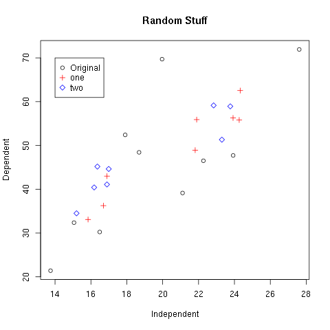
Figure 1.
Another common task is to change the limits of the axes to change the size of the plotting area. This is achieved using the xlim and ylim options in the plot command. Both options take a vector of length two that have the minimum and maximum values.
> plot(x,y,xlab="Independent",ylab="Dependent",main="Random Stuff",xlim=c(0,30),ylim=c(0,100))
> points(x1,y1,col=2,pch=3)
> points(x2,y2,col=4,pch=5)
> legend(14,70,c("Original","one","two"),col=c(1,2,4),pch=c(1,3,5))
6.1.2. Error Bars
Another common task is to add error bars to a set of data points. This can be accomplished using the arrows command. The arrows command takes two pairs of coordinates, that is two pairs of x and y values. The command then draws a line between each pair and adds an “arrow head” with a given length and angle.
> plot(x,y,xlab="Independent",ylab="Dependent",main="Random Stuff")
> xHigh <- x
> yHigh <- y + abs(rnorm(10,sd=3.5))
> xLow <- x
> yLow <- y - abs(rnorm(10,sd=3.1))
> arrows(xHigh,yHigh,xLow,yLow,col=2,angle=90,length=0.1,code=3)
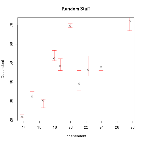
Figure 2.
Note that the option code is used to specify where the bars are drawn. Its value can be 1, 2, or 3. If code is 1 the bars are drawn at pairs given in the first argument. If code is 2 the bars are drawn at the pairs given in the second argument. If code is 3 the bars are drawn at both.
6.1.3. Adding Noise (jitter)
In the previous example a little bit of “noise” was added to the pairs to produce an artificial offset. This is a common thing to do for making plots. A simpler way to accomplish this is to use the jitter command.
> numberWhite <- rhyper(400,4,5,3)
> numberChipped <- rhyper(400,2,7,3)
> par(mfrow=c(1,2))
> plot(numberWhite,numberChipped,xlab="Number White Marbles Drawn",
       ylab="Number Chipped Marbles Drawn",main="Pulling Marbles")
> plot(jitter(numberWhite),jitter(numberChipped),xlab="Number White Marbles Drawn",
       ylab="Number Chipped Marbles Drawn",main="Pulling Marbles With Jitter")
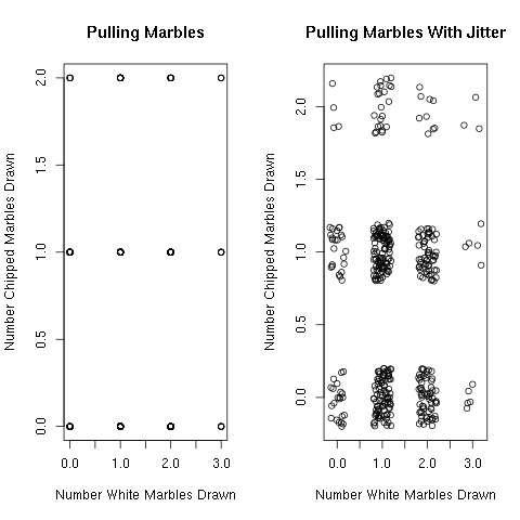
Figure 3.
6.1.4. Multiple Graphs on One Image
Note that a new command was used in the previous example. The par command can be used to set different parameters. In the example above the mfrow was set. The plots are arranged in an array where the default number of rows and columns is one. The mfrow parameter is a vector with two entries. The first entry is the number of rows of images. The second entry is the number of columns. In the example above the plots were arranged in one row with two plots across.
> par(mfrow=c(2,3))
> boxplot(numberWhite,main="first plot")
> boxplot(numberChipped,main="second plot")
> plot(jitter(numberWhite),jitter(numberChipped),xlab="Number White Marbles Drawn",
       ylab="Number Chipped Marbles Drawn",main="Pulling Marbles With Jitter")
> hist(numberWhite,main="fourth plot")
> hist(numberChipped,main="fifth plot")
> mosaicplot(table(numberWhite,numberChipped),main="sixth plot")
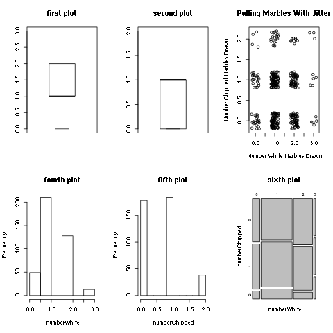
Figure 4.
6.1.5. Density Plots
There are times when you do not want to plot specific points but wish to plot a density. This can be done using the smoothScatter command.
> numberWhite <- rhyper(30,4,5,3)
> numberChipped <- rhyper(30,2,7,3)
> smoothScatter(numberWhite,numberChipped,
             xlab="White Marbles",ylab="Chipped Marbles",main="Drawing Marbles")
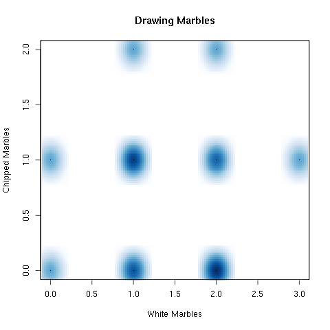
Figure 5.
Note that the previous example may benefit by superimposing a grid to help delimit the points of interest. This can be done using the grid command.
> numberWhite <- rhyper(30,4,5,3)
> numberChipped <- rhyper(30,2,7,3)
> smoothScatter(numberWhite,numberChipped,
             xlab="White Marbles",ylab="Chipped Marbles",main="Drawing Marbles")
> grid(4,3)
6.1.6. Pairwise Relationships
There are times that you want to explore a large number of relationships. A number of relationships can be plotted at one time using the pairs command. The idea is that you give it a matrix or a data frame, and the command will create a scatter plot of all combinations of the data.
> uData <- rnorm(20)
> vData <- rnorm(20,mean=5)
> wData <- uData + 2*vData + rnorm(20,sd=0.5)
> xData <- -2*uData+rnorm(20,sd=0.1)
> yData <- 3*vData+rnorm(20,sd=2.5)
> d <- data.frame(u=uData,v=vData,w=wData,x=xData,y=yData)
> pairs(d)
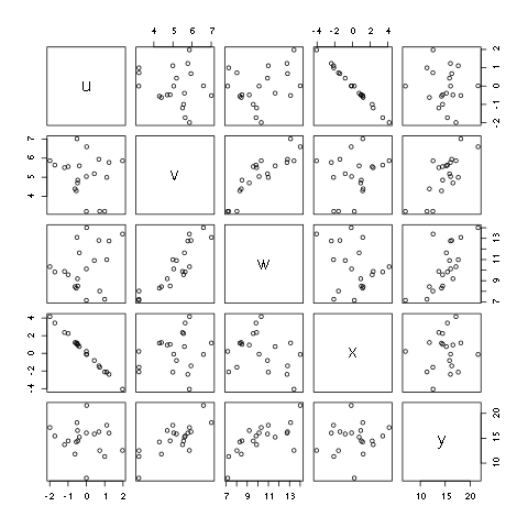
Figure 5.
6.1.7. Shaded Regions
A shaded region can be plotted using the polygon command. The polygon command takes a pair of vectors, x and y, and shades the region enclosed by the coordinate pairs. In the example below a blue square is drawn. The vertices are defined starting from the lower left. Five pairs of points are given because the starting point and the ending point is the same.
> x = c(-1,1,1,-1,-1)
> y = c(-1,-1,1,1,-1)
> plot(x,y)
> polygon(x,y,col='blue')
>
A more complicated example is given below. In this example the rejection region for a right sided hypothesis test is plotted, and it is shaded in red. A set of custom axes is constructed, and symbols are plotted using the expression command.
> stdDev <- 0.75;
> x <- seq(-5,5,by=0.01)
> y <- dnorm(x,sd=stdDev)
> right <- qnorm(0.95,sd=stdDev)
> plot(x,y,type="l",xaxt="n",ylab="p",
       xlab=expression(paste('Assumed Distribution of ',bar(x))),
       axes=FALSE,ylim=c(0,max(y)*1.05),xlim=c(min(x),max(x)),
       frame.plot=FALSE)
> axis(1,at=c(-5,right,0,5),
       pos = c(0,0),
       labels=c(expression(' '),expression(bar(x)[cr]),expression(mu[0]),expression(' ')))
> axis(2)
> xReject <- seq(right,5,by=0.01)
> yReject <- dnorm(xReject,sd=stdDev)
> polygon(c(xReject,xReject[length(xReject)],xReject[1]),
          c(yReject,0, 0), col='red')
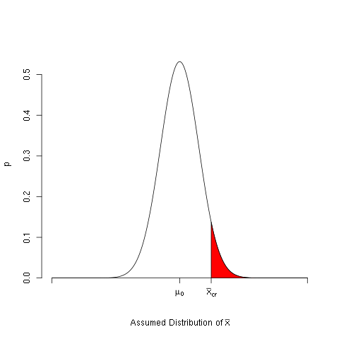
Figure 6.
The axes are drawn separately. This is done by first suppressing the plotting of the axes in the plot command, and the horizontal axis is drawn separately. Also note that the expression command is used to plot a Greek character and also produce subscripts.
6.1.8. Plotting a Surface
Finally, a brief example of how to plot a surface is given. The persp command will plot a surface with a specified perspective. In the example, a grid is defined by multiplying a row and column vector to give the x and then the y values for a grid. Once that is done a sine function is specified on the grid, and the persp command is used to plot it.
> x <- seq(0,2*pi,by=pi/100)
> y <- x
> xg <- (x*0+1) %*% t(y)
> yg <- (x) %*% t(y*0+1)
> f <- sin(xg+yg)
> persp(x,y,f,theta=-10,phi=40)
>
The %*% notation is used to perform matrix multiplication.
6.2. Discrete Data
Contents
In the examples below a data set is defined using R’s hypergeometric random number generator.
> numberWhite <- rhyper(30,4,5,3)
> numberChipped <- rhyper(30,2,7,3)
6.2.1. Barplot
The plot command will try to produce the appropriate plots based on the data type. The data that is defined above, though, is numeric data. You need to convert the data to factors to make sure that the plot command treats it in an appropriate way. The as.factor command is used to cast the data as factors and ensures that R treats it as discrete data.
> numberWhite <- rhyper(30,4,5,3)
> numberWhite <- as.factor(numberWhite)
> plot(numberWhite)
>
In this case R will produce a barplot. The barplot command can also be used to create a barplot. The barplot command requires a vector of heights, though, and you cannot simply give it the raw data. The frequencies for the barplot command can be easily calculated using the table command.
> numberWhite <- rhyper(30,4,5,3)
> totals <- table(numberWhite)
> totals
numberWhite
0  1  2  3
4 13 11  2
> barplot(totals,main="Number Draws",ylab="Frequency",xlab="Draws")
>
In the previous example the barplot command is used to set the title for the plot and the labels for the axes. The labels on the ticks for the horizontal axis are automatically generated using the labels on the table. You can change the labels by setting the row names of the table.
> totals <- table(numberWhite)
> rownames(totals) <- c("none","one","two","three")
> totals
numberWhite
none   one   two three
4      13    11     2
> barplot(totals,main="Number Draws",ylab="Frequency",xlab="Draws")
>
The order of the frequencies is the same as the order in the table. If you change the order in the table it will change the way it appears in the barplot. For example, if you wish to arrange the frequencies in descending order you can use the sort command with the decreasing option set to TRUE.
> barplot(sort(totals,decreasing=TRUE),main="Number Draws",ylab="Frequency",xlab="Draws")
The indexing features of R can be used to change the order of the frequencies manually.
> totals
numberWhite
 none   one   two three
   4    13    11     2
> sort(totals,decreasing=TRUE)
numberWhite
 one   two  none three
  13    11     4     2
> totals[c(3,1,4,2)]
numberWhite
 two  none three   one
  11     4     2    13
> barplot(totals[c(3,1,4,2)])
>
The barplot command returns the horizontal locations of the bars. Using the locations and putting together the previous ideas a Pareto Chart can be constructed.
> xLoc = barplot(sort(totals,decreasing=TRUE),main="Number Draws",
           ylab="Frequency",xlab="Draws",ylim=c(0,sum(totals)+2))
> points(xLoc,cumsum(sort(totals,decreasing=TRUE)),type='p',col=2)
> points(xLoc,cumsum(sort(totals,decreasing=TRUE)),type='l')
>
6.2.2. Mosaic Plot
Mosaic plots are used to display proportions for tables that are divided into two or more conditional distributions. Here we focus on two way tables to keep things simpler. It is assumed that you are familiar with using tables in R (see the section on two way tables for more information: Two Way Tables).
Here we will use a made up data set primarily to make it easier to figure out what R is doing. The fictitious data set is defined below. The idea is that sixteen children of age eight are interviewed. They are asked two questions. The first question is, “do you believe in Santa Claus.” If they say that they do then the term “belief” is recorded, otherwise the term “no belief” is recorded. The second question is whether or not they have an older brother, older sister, or no older sibling. (We are keeping it simple here!) The answers that are recorded are “older brother,” “older sister,” or “no older sibling.”
> santa <- data.frame(belief=c('no belief','no belief','no belief','no belief',
                               'belief','belief','belief','belief',
                               'belief','belief','no belief','no belief',
                               'belief','belief','no belief','no belief'),
                      sibling=c('older brother','older brother','older brother','older sister',
                                'no older sibling','no older sibling','no older sibling','older sister',
                                'older brother','older sister','older brother','older sister',
                                'no older sibling','older sister','older brother','no older sibling')
                      )
 > santa
       belief          sibling
 1  no belief    older brother
 2  no belief    older brother
 3  no belief    older brother
 4  no belief     older sister
 5     belief no older sibling
 6     belief no older sibling
 7     belief no older sibling
 8     belief     older sister
 9     belief    older brother
 10    belief     older sister
 11 no belief    older brother
 12 no belief     older sister
 13    belief no older sibling
 14    belief     older sister
 15 no belief    older brother
 16 no belief no older sibling
 >  summary(santa)
   belief              sibling
 belief   :8   no older sibling:5
 no belief:8   older brother   :6
               older sister    :5
The data is given as strings, so R will automatically treat them as categorical data, and the data types are factors. If you plot the individual data sets, the plot command will default to producing barplots.
> plot(santa$belief)
> plot(santa$sibling)
>
If you provide both data sets it will automatically produce a mosaic plot which demonstrates the relative frequencies in terms of the resulting areas.
> plot(santa$sibling,santa$belief)
> plot(santa$belief,santa$sibling)
The mosaicplot command can be called directly
> totals = table(santa$belief,santa$sibling)
> totals

            no older sibling older brother older sister
  belief                   4             1            3
  no belief                1             5            2
> mosaicplot(totals,main="Older Brothers are Jerks",
              xlab="Belief in Santa Claus",ylab="Older Sibling")
The colours of the plot can be specified by setting the col argument. The argument is a vector of colours used for the rows. See Fgure :ref`figure7_intermediatePlotting` for an example.
> mosaicplot(totals,main="Older Brothers are Jerks",
              xlab="Belief in Santa Claus",ylab="Older Sibling",
              col=c(2,3,4))
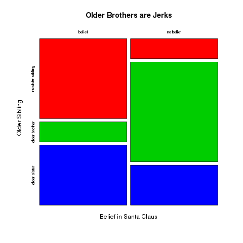
Figure 7.
The labels and the order that they appear in the plot can be changed in exactly the same way as given in the examples for barplot above.
> rownames(totals)
[1] "belief"    "no belief"
> colnames(totals)
[1] "no older sibling" "older brother"    "older sister"
> rownames(totals) <- c("Believes","Does not Believe")
> colnames(totals) <- c("No Older","Older Brother","Older Sister")
> totals

                   No Older Older Brother Older Sister
  Believes                4             1            3
  Does not Believe        1             5            2
> mosaicplot(totals,main="Older Brothers are Jerks",
              xlab="Belief in Santa Claus",ylab="Older Sibling")
When changing the order keep in mind that the table is a two dimensional array. The indices must include both rows and columns, and the transpose command (t) can be used to switch how it is plotted with respect to the vertical and horizontal axes.
> totals

                   No Older Older Brother Older Sister
  Believes                4             1            3
  Does not Believe        1             5            2
> totals[c(2,1),c(2,3,1)]

                   Older Brother Older Sister No Older
  Does not Believe             5            2        1
  Believes                     1            3        4
> mosaicplot(totals[c(2,1),c(2,3,1)],main="Older Brothers are Jerks",
       xlab="Belief in Santa Claus",ylab="Older Sibling",col=c(2,3,4))
> mosaicplot(t(totals),main="Older Brothers are Jerks",
       ylab="Belief in Santa Claus",xlab="Older Sibling",col=c(2,3))
6.3. Miscellaneous Options
Contents
The previous examples only provide a slight hint at what is possible. Here we give some examples that provide a demonstration of the way the different commands can be combined and the options that allow them to be used together.
6.3.1. Multiple Representations On One Plot
First, an example of a histogram with an approximation of the density function is given. In addition to the density function a horizontal boxplot is added to the plot with a rug representation of the data on the horizontal axis. The horizontal bounds on the histogram will be specified. The boxplot must be added to the histogram, and it will be raised above the histogram.
> x = rexp(20,rate=4)
> hist(x,ylim=c(0,18),main="This Are An Histogram",xlab="X")
> boxplot(x,at=16,horizontal=TRUE,add=TRUE)
> rug(x,side=1)
> d = density(x)
> points(d,type='l',col=3)
>
6.3.2. Multiple Windows
The dev commands allow you to create and manipulate multiple graphics windows. You can create new windows using the dev.new() command, and you can choose which one to make active using the dev.set() command. The dev.list(), dev.next(), and dev.prev() command can be used to list the graphical devices that are available.
In the following example three devices are created. They are listed, and different plots are created on the different devices.
> dev.new()
> dev.new()
> dev.new()
> dev.list()
X11cairo X11cairo X11cairo
       2        3        4
> dev.set(3)
X11cairo
       3
> x = rnorm(20)
> hist(x)
> dev.set(2)
X11cairo
       2
> boxplot(x)
> dev.set(4)
X11cairo
       4
> qqnorm(x)
> qqline(x)
> dev.next()
X11cairo
       2
> dev.set(dev.next())
X11cairo
       2
> plot(density(x))
>
6.3.3. Print To A File
There are a couple ways to print a plot to a file. It is important to be able to work with graphics devices as shown in the previous subsection (Multiple Windows). The first way explored is to use the dev.print command. This command will print a copy of the currently active device, and the format is defined by the device argument.
In the example below, the current window is printed to a png file called “hist.png” that is 200 pixels wide.
> x = rnorm(100)
> hist(x)
> dev.print(device=png,width=200,"hist.png")
>
To find out what devices are available on your system use the help command.
> help(device)
Another way to print to a file is to create a device in the same way as the graphical devices were created in the previous section. Once the device is created, the various plot commands are given, and then the device is turned off to write the results to a file.
> png(file="hist.png")
> hist(x)
> rug(x,side=1)
> dev.off()
6.3.4. Annotation and Formatting
Basic annotation can be performed in the regular plotting commmands. For example, there are options to specify labels on axes as well as titles. More options are available using the axis command.
Most of the primary plotting commands have an option to turn off the generation of the axes using the axes=FALSE option. The axes can be then added using the axis command which allows for a greater number of options.
In the example below a bivariate set of random numbers are generated and plotted as a scatter plot. The axes are added, but the horizontal axis is located in the center of the data rather than at the bottom of the figure. Note that the horizontal and vertical axes are added separately, and are specified using the first argument to the command. (Use help(axis) for a full list of options.)
> x <- rnorm(10,mean=0,sd=4)
> y <- 3*x-1+rnorm(10,mean=0,sd=2)
   summary(x)
    Min. 1st Qu.  Median    Mean 3rd Qu.    Max.
 -6.1550 -1.9280  1.2000 -0.1425  2.4780  3.1630
> summary(y)
    Min.  1st Qu.   Median     Mean  3rd Qu.     Max.
-17.9800  -9.0060   0.7057  -1.2060   8.2600  10.9200
> plot(x,y,axes=FALSE,col=2)
> axis(1,pos=c(0,0),at=seq(-7,5,by=1))
> axis(2,pos=c(0,0),at=seq(-18,11,by=2))
>
In the previous example the at option is used to specify the tick marks.
When using the plot command the default behavior is to draw an axis as well as draw a box around the plotting area. The drawing of the box can be suppressed using the bty option. The value can be “o,” “l,” “7,” “c,” “u”, “],” or “n.” (The lines drawn roughly look like the letter given except for “n” which draws no lines.) The box can be drawn later using the box command as well.
> x <- rnorm(10,mean=0,sd=4)
> y <- 3*x-1+rnorm(10,mean=0,sd=2)
> plot(x,y,bty="7")
> plot(x,y,bty="n")
> box(lty=3)
>
The par command can be used to set the default values for various parameters. A couple are given below. In the example below the default background is set to grey, no box will be drawn around the window, and the margins for the axes will be twice the normal size.
> par(bty="l")
> par(bg="gray")
> par(mex=2)
> x <- rnorm(10,mean=0,sd=4)
> y <- 3*x-1+rnorm(10,mean=0,sd=2)
> plot(x,y)
>
Another common task is to place a text string on the plot. The text command takes a coordinate and a label, and it places the label at the given coordinate. The text command has options for setting the offset, size, font, and other options. In the example below the label “numbers!” is placed on the plot. Use help(text) to see more options.
> x <- rnorm(10,mean=0,sd=4)
> y <- 3*x-1+rnorm(10,mean=0,sd=2)
> plot(x,y)
> text(-1,-2,"numbers!")
>
The default text command will cut off any characters outside of the plot area. This behavior can be overridden using the xpd option.
> x <- rnorm(10,mean=0,sd=4)
> y <- 3*x-1+rnorm(10,mean=0,sd=2)
> plot(x,y)
> text(-7,-2,"outside the area",xpd=TRUE)
>